Designing An Ios App In Sketch Part 2 Of 3
In this 3 part tutorial (I wanted to break it into more digestible chunks) we'll be creating screens for a fictional, 'Pay It Forward' iOS App called 'Piece'.
If you haven't already, grab these required elements to follow along with this tutorial…
- Sketch (Stating the obvious here)
- Iconjar
- San Francisco Fonts
- Icon Set
- Unsplash It Sketch (Plugin)
- Content Generator for Sketch (Plugin)
Let's make a start on the final part of this tutorial…
Monthly Planner

We'll be using a new background image for our Monthly Planner screen, so go ahead and draw out a Rectangle (R), 375px wide, and 667px high (remember to remove the border), which covers the Artboard. Run the Unsplash It plugin to choose a suitable image.
Draw out another Rectangle (R), with the same dimensions as the one you just created, and then choose your gradient Shared Style from the Inspector Panel.

Insert the Menu + Search Symbol you created before, and align this correctly on the Artboard.
Drop in your Text Style, and change the wording to something like 'December, 2015', then align this on the Artboard.
From Iconjar, grab both the arrow left, and arrow right icons. Then, using the Scale tool, reduce the height of these icons to 20px, and the color to #FFFFFF.
With the arrow icons, and text layer selected, use Align Vertically to tighten the elements up.

Hold Alt so you can measure the correct distance between your title, and control bar.

Now, let's get our circular graph chart into place shall we?

Firstly, draw out a circle with the Oval Tool (O), 200px x 200px. Remove the Fill Color, change the Border Color to #FFFFFF, and increase the Border Thickness to 6px.
Then, using the Scissors tool, click on a section of the circle to remove it…

With the circle still selected, right click, and choose Duplicate. Give the circle a color value of #8C72E3, and then place that layer behind your white circle.
Using the Transform option, enter 180 into the Rotate field.

Quick Note: There are various ways to create circular graphs inside of Sketch. For this tutorial I've shown you one, quick, and easy way.
Insert a new Text Layer (T), adjust the wording to something like '25', and give it the following settings…
- Typeface: SF UI Display
- Weight: Regular
- Color: #FFFFFF
- Size: 70
- Alignment: Center
Insert another Text Layer (T), change the text to the percentage sign (%), and give it the following settings…
- Typeface: SF UI Display
- Weight: Regular
- Color: #FFFFFF
- Size: 40
- Alignment: Center
Add the final Text Layer (T) for the circular graph, adjust the wording to something like '4 Deeds Complete', and give it the following settings…
- Typeface: SF UI Display
- Weight: Light
- Color: #FFFFFF
- Size: 13
- Alignment: Center
- Character Spacing: 1.5
Group all of the graph elements together, and then align them correctly on your Artboard.

To finish up this screen, quickly add 2 Text Layers (T). For the first Text Layer change the wording to something like 'You're on course to reach your goal for this month.', and enter these settings…
- Typeface: SF UI Display
- Weight: UltraLight
- Color: #FFFFFF
- Size: 15
- Alignment: Center
- Character Spacing: 1.5
And for the second Text Layer adjust the wording to something like 'A big high-five for you!', and use the following settings…
- Typeface: SF UI Display
- Weight: Light
- Color: #FFFFFF
- Size: 15
- Alignment: Center
- Character Spacing: 1.5
Then align these correctly on your Artboard. And that's this screen all wrapped up!

Settings
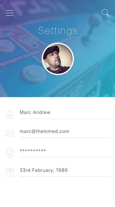
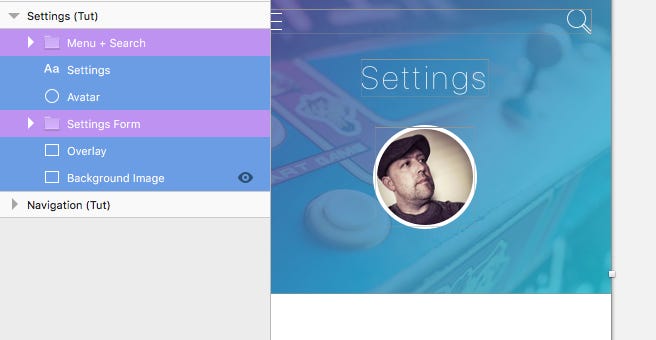
We will be using a new background image for our Settings screen, so draw out a Rectangle (R), 375px wide, and 315px high (remember to remove the border). Run the Unsplash It plugin to choose a suitable image.
Draw out another Rectangle (R), with the same dimensions as the one you just created, and then choose your gradient Shared Style from the Inspector Panel.
Insert the Menu + Search Symbol you created before, and align this correctly on the Artboard.

Drop in your Text Style, and change the wording to 'Settings', then align correctly on the Artboard.

For the Avatar, we will be using the same one we created for the Daily Deeds screen previously. So copy, and paste that across, and place it underneath the title.

Time to get those input fields into place.

To save time, and to avoid having to design all of those elements from scratch, we'll insert the 'Form Fields (Sign Up)' Symbol that we created in Part 1 of this tutorial.
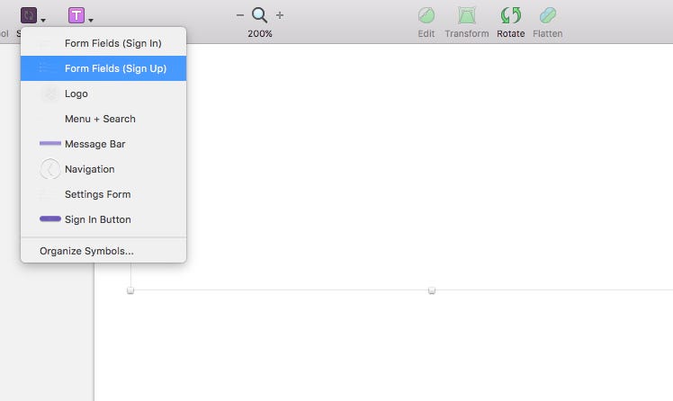
But, before we go any further, we don't want to affect the Symbol that we created for the Sign Up screen, so with the Symbol selected, click on the Select menu in the Inspector, and choose Duplicate Symbol.

Then rename this new Symbol to 'Settings Form'.
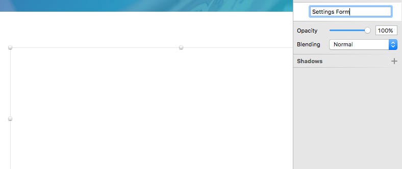
Of course, you'll be currently looking at an invisible element on your design due to the colors we used on the original Symbol. That's not really helpful currently is it!
But, via the Layers List, we can select each of those elements and make the necessary color adjustments.

So go into the Layers List and adjust the icons Fill Color to #DEDEDE. Do the same for the Line also.

For the Text Layers change the color to #303030, and adjust the wording accordingly.

We'll add one more field to our 'Settings Form', so from Iconjar, drag and drop in the present icon. Then, with the Scale tool, reduce the width to 25px, and change the color to #DEDEDE.
Taking cues from the existing fields, add a Text Layer, and Line, to sit alongside your icon, and then align the elements correctly.

Quick Note: Make sure that the icon, text layer, and line that you just added are contained inside the Symbol, and not sat outside of that group/folder.

And that's our Settings screen complete.
Let's move onto the final screen…
Navigation
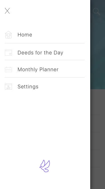
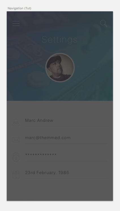
Firstly, select all of the elements from the Settings Artboard, and then holding Alt (which will duplicate them in the process), drag those elements across to your Navigation Artboard.
Then draw out a Rectangle (R) to cover the Artboard, give it a Fill Color of #303030 with 80% opacity.
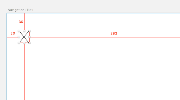
Draw our another Rectangle (R), with a height of 667px, and a width of 320px, then apply the following settings…
- Fill Color: #FFFFFF
- Borders: None
- Shadows: Color: #000000 Opacity: 40% X: 4 Y: 2 Blur: 15

From Iconjar, drag in the close symbol icon, and position it correctly on the background layer we just created.
Now let's liven things up with a few navigation items…
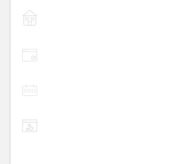
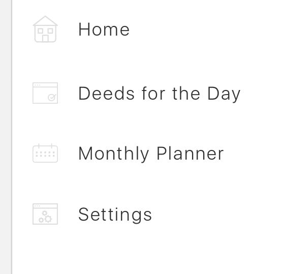
Jump back to Iconjar, and select the home icon. Click, and drag it onto your Artboard. Do the same for the planner, calendar, and settings icons.
Selecting each icon at a time. Click on the Scale tool, and reduce the width to 25px. Then change the color of each icon to #DEDEDE.
With all icons selected, use Align Left, and then using Alt, position them 20px from the left edge of the Artboard.
Insert 4 Text Layers. One for each icon, and change the wording accordingly…
- Home
- Deeds for the Day
- Monthly Planner
- Settings
Then adjust the settings for those text layers…
- Typeface: SF UI Display
- Weight: Light
- Color: #303030
- Size: 18
- Alignment: Left
- Character Spacing: 1.5
And align them correctly next to each icon.
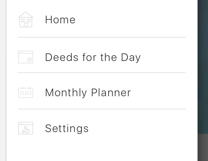
Draw out a 1px Line (L) to act as a Divider between each Navigation item. Make it 280px in Length, with a Border Color of #DEDEDE.
Then, using the Alignment tools, make sure everything is aligned nice, and tight.
Quickly finish up this screen with the 'Piece' logo.
Drop in the dove icon from Iconjar, and Scale it down to 40px in Width, and give it a Fill Color of #8C72E3. Position it at the bottom of the Navigation panel.

And that brings us to the end of this 3 Part Tutorial. Now get out there and create some awesome!
Thanks for reading the article,
Marc
Designing An Ios App In Sketch Part 2 Of 3
Source: https://medium.com/sketch-app-sources/designing-an-ios-app-in-sketch-part-3-of-3-9f0339f7c0c6
Posted by: wolfesaper1974.blogspot.com

0 Response to "Designing An Ios App In Sketch Part 2 Of 3"
Post a Comment